

Introducing the exciting new energy drink, PERK! A sparkling chilled coffee drink that will re-java-nate your day. It’s available in vanilla and a luscious mocha flavor, my personal favorite.
If you’re a coffee freak like me you’ll love it. It comes loaded with the same amount of caffeine as two cups of coffee. Also included in the line up is a No Sugar version called PERK! ZERO, with the same great flavors. The new drink is an incredible mixer for cocktails and an unbelievable treat when you add a scoop of ice cream to the mix.
We designed this delicious coffee beverage’s package & bottle in association with Rainforest Beverages.
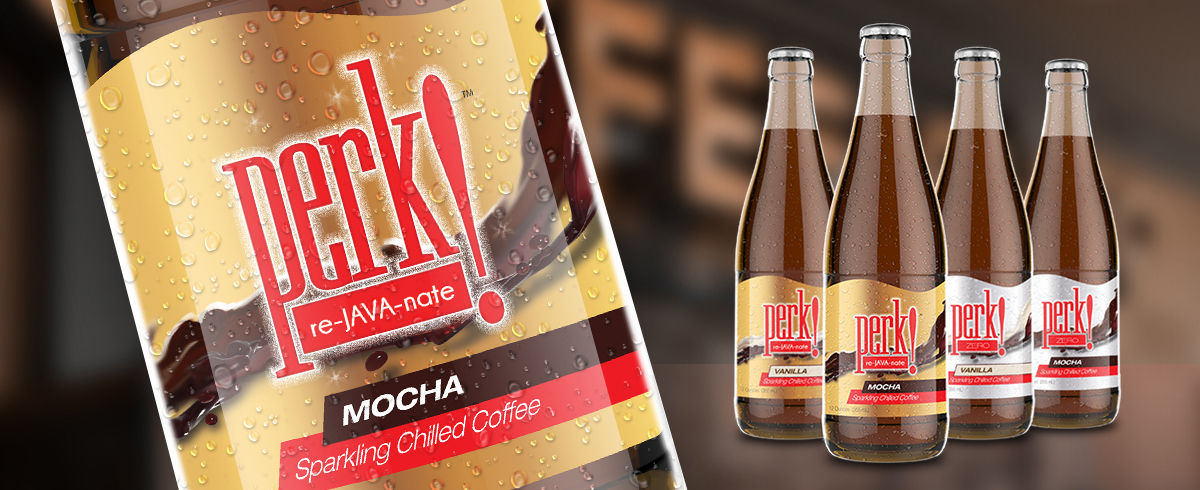
We just recently sent the final files for their new glass bottle labels to the printer and here they are:

A family shot of the Perk! bottles with their foil labels
Wow, that product shot alone is making me crave some Re-Java-nation. (Alright…I’ll keep the puns from here on out to a minimum.)
How We Started
The first step in the design process for any package design is the center point of the product and the brand: the Logo. This helps both our design team and the client discover the style and personality of the brand.
Notice the Exclamation point and the fizzy glow. As well as the red that conveys excitement.
With Perk!, it was very important to emphasize the exclamation point (!).
It’s a great symbol for the brand because it’s a beverage that will help perk you up!
The exclamation point highlights the type of beverage and the effects of the beverage.
The other point of importance that carries some meaning in the logo is the sparkling glow.
The glow reinforces, visually, that the beverage is carbonated. A very refreshing and exhilarating difference that Perk! has to its competition.
And the last thing you’ll notice (or the first), is the choice of the strong color red. Not only does red convey excitement, it truly helps the bottle stick out from its competition on that refrigerated shelf in a store. For more in-depth information on the psychological effects of color in design, check out this article.
The Tight-wire Process of Beverage Package Design
The next step in the process is a tough one. It involves our client and their design team (us) to walk a tight-wire of what’s possible, both physically and financially.
If you look at business solely from a logic stand point, it’s all about the balancing the least amount of risk for the highest return. This phase of the process takes that idea straight on.
We have to figure out what type of container to use, what type of printing will be used for that container, and what results we will have from it. We have to look at all of our options as to what type of systems that we can use to transport the product to the consumer. We then have to ask ourselves a long list of questions:
- What would be the cheapest?
- What would look the best?
- What would be the easiest to transport?
- What would be the easiest to produce?
- What would best ‘react’ to the product?
- What would be best for the final vendors?
- What would go best with our Brand?
There are almost endless variables. For instance, with Perk!, We had started the design process with the main product being contained with-in a plastic bottle; very standard for a product of this kind.

Perk!’s initial bottle was plastic.
It’s what much of Perk!’s competition uses. This is due to its low-cost of production, shipping, and a variety of other reasons.
The decision, however, was made to move over to a glass bottle.
This is because it helped elevate the product and the brand. The extra costs associated with a glass bottle were more than worth it by the fact that it helped separate Perk! from its competition.
Die-line Dilemmas
Once the decision of the container type is made, we figure out the die-line for the piece. A die-line is a universal piece in package design that carries incredible importance.
It’s what dictates the shape of the graphics that will be printed onto your package. It’s that key piece that any printer will require to convert your piece from digital artwork to the real thing.
Generally, it’s something that the printer can provide you. If you can work with a standard die-line from your printer, you can normally save a substantial amount on your printing.
This is due to the fact that your printer already would have a standard process for producing that die-line. There’s nothing extra for them to figure out.
However, if you have a custom label die-line, like Perk!, a custom die-line will need to be created.
What’s custom about the Perk! die-line? That ‘S’ curve on the top edge of the label.

This S-Curve adds a whole other level to the printing of this design.
Luckily, in Perk!s case, this extra s-curve die-cut didn’t add a substantial cost to their final printing. It did, however, add that additional ‘something’ that helped support the product’s uniqueness.
Foiling Concerns About Foil
One of the last challenges of this bottle design was the foil effect on the label. It was something that both ourselves and the client thought would be just another aspect of the design that would really help Perk! catch a consumer’s eye from the shelf.
At first, with the plastic bottle, it was decided that we would try our best to replicate the light effects of foil on a standard printed piece.
Though the result wasn’t horrific, it could not match how foil catches and bends light as it does. With the decision of a glass bottle, the decision of foil on the final piece was decided as well.
The material used on this piece was not actually foil. When a product will be getting wet (Perk! will be refrigerated) the use of a plastic substrate that looks metallic like foil is a must. This is because actual foil is a sort-of paper material that gets ‘soggy’ when wet.
One other piece that you’ll notice with the design is the silver vs gold foils for the sugar-free vs diet Perk!. This goes back to utilizing cultural factors that people are used to. Due to various large brands reinforcing this with their beverages, people automatically think silver means diet.
It’s a Process
After this entire birthing process, here is the final product sitting in our client’s fridge:

That foil adds an awesome effect
As you can see, from the rigmarole involved in a package design, we always emphasize that a package design is an in-depth process. It’s not just do it and done. That’s why it’s so important to have a design team to work with you.
If you need help with your products package design, contact us today!
Perk! will now be tested in two markets and hopefully be coming to a store near you soon. Ask for it in your local grocery store. For more information of Perk!, Click Here.