


Click Here Inventor Spot for the 10 greatest sports logos ever. Do you agree with their rankings? Let us know what you think by leaving a comment below.
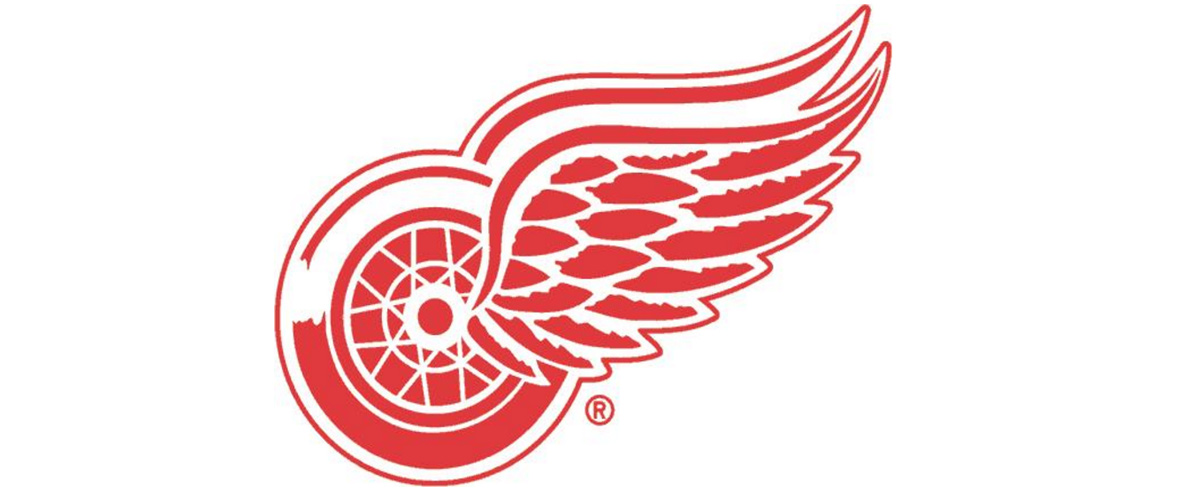
The featured image no doubt will make the number one selection underwhelming, yet this should matter not. The hockey team Detroit Red Wings has the perfect amalgamation of local dynamics mingled with aesthetic considerations to present what I think is one of the perfect logos.
They don’t call Detroit “Motor City” for nothin’. Additionally, in 1932, a man by the name of James L. Norris purchased the franchise, which was formerly called The Cougars. Norris’ old team from his heyday, the Montreal HC, had the monicker the “Winged Wheelers”; so, we can see how all of this localization and lore can conflate into the image we now behold today.
Image Source: Detroit Red Wings.